Best Green Paint Colours For Kitchen Cabinets

Photo by Decima Athens via Unsplash
Green has become a very popular choice for kitchen cabinets, offering a fresh, natural, and versatile alternative to traditional neutral tones. Whether you're after a soft sage, a rich olive, or a deep forest green, there's a shade to suit every style of kitchen. Green cabinets can bring an organic, nature-inspired feel to your kitchen, balancing warmth and vibrancy while still maintaining a timeless appeal.
Discover some of my favourite green paint colours from Benjamin Moore and Sherwin Williams. From subtle, muted tones to bold, dramatic shades, these colours can instantly elevate the look of your kitchen. I’ll dive into the undertones, lighting effects, and best coordinating colours to help you choose the perfect green for your cabinets, ensuring your kitchen feels inviting, stylish, and on-trend.
1/ October Mist 1495 by Benjamin Moore

October Mist by Benjamin Moore is a beautiful muted sage green with grey undertones and a very subtle warmth. It is a great tone to reconnect with nature and create a bright and fresh look in your kitchen. It can be used as an overall cabinet colour, on a kitchen island in combination with white cabinets. October Mist can be successfully used in any light exposure. In north-facing rooms or in an afternoon eastern light, this sage green could show its grey undertones slightly more and appear colder. In south-facing rooms or afternoon western light, its soft muted hues help balance out the warm light and create a bright subtly warm space.

Photo by The Nordroom
October Mist can be paired with warm whites such as BM Simply White and BM Cloud White, a light grey or greige with green undertones like BM Balboa Mist, a muted terracotta, a muted dark blue, or a darker muted green.
2/ Peale Green HC-121 by Benjamin Moore

Peale Green is a classic warm forest green with a very slight touch of yellow. It is a great tone to bring a touch of nature to your kitchen and create an elegant and sophisticated space. It’s a rather neutral green that adapts well to different lighting exposures looking best in areas that receive ample natural light to reveal all its beautiful tones. In darker spaces or on dimly lit walls or cabinets, Peale Green will look like an even deeper forest green.

Photo via Renee Renovates
Pair Peale Green with a warm white like BM White Dove or BM Cotton Balls, a warm off-white or pale beige like BM Soft Chamois, or a light greige such as BM Revere Pewter.
3/ Tate Olive HC-112 by Benjamin Moore (my fave!)
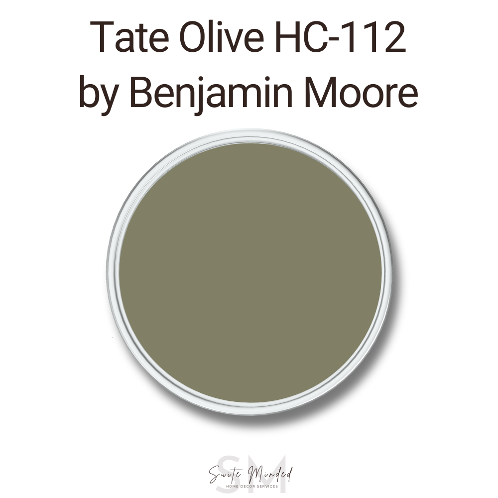
Tate Olive is one of my favourite green paint colours for kitchen cabinets. It is a warm muted olive green with a hint of yellow undertones. It’s a very grounding colour, perfect for a modern and elegant look with a luxurious feel. In a north-facing room or an afternoon eastern light, this muted green can look slightly more greyish without losing all its warmth. It can create a sophisticated balanced look. In a south-facing room or an afternoon western light, Tate Olive can lean into its yellow undertones more, thus enhancing its warmth subtly.

Photo via Pinterest
Tate Olive pairs beautifully with soft whites like BM White Dove or BM Simply White to create a gorgeous contrast, a muted beige like BM Sail Cloth, a warm neutral tan like BM Natural Linen or BM Manchester Tan, a muted caramel or terracotta tone for an eclectic and elegant look.
Choosing paint colours is overwhelming, so I’ve done the hard work for you! My whole-house colour palettes are expertly curated and designed to help you take the guesswork out of picking coordinating colours so you can create a cohesive, inviting home with confidence. Shop my colour palettes now!


4/ Evergreen Fog 9130 by Sherwin Williams

Evergreen Fog is a very popular shade of sage green. It is usually recommended in interior decorating as it is a rather balanced neutral green that holds itself well in any lighting exposure (north, south, east, or west-facing rooms). Evergreen Fog has grey undertones that help it stay balanced and not fall in the category of green-yellow tones (olive greens) or blue-greens (such as teal). It can be successfully used in any space, on walls and cabinets, to create a soft nature-inspired look.

Photo via Tinted - a blog by Sherwin Williams
Evergreen Fog is quite versatile and pairs well with a range of different tones. Consider a muted neutral tone with some grey undertones like Accessible Beige, a muted off-white, a soft slightly muted white like Sherwin Williams Pure White, Alabaster, or Benjamin Moore White Dove, or a pale grey with slightly blue or violet undertones such as Sherwin Williams Gray Screen or Benjamin Moore Classic Gray.
5/ Retreat 6207 by Sherwin Williams

Retreat is another favourite green colour. It goes beautifully on walls and cabinets for an earthy look with depth and character. Retreat is a cool shade of green with blue undertones that are softened by grey tones, preventing it from looking too cold. This blend of blue and grey undertones means that this green will look stunning in any lighting exposure. It will help a northern or afternoon-eastern light look balanced and create a cosy, relaxing space; while in a south-facing room or afternoon western light, it will tone down the warm light for an inviting earthy look.

Photo by @hottohouse via Mod and Mood
For a white trim colour, consider pairing Retreat with a bright white without too many undertones like Sherwin Williams Pure White or Benjamin Moore Chantilly Lace to create a nice clean contrast. Retreat also works beautifully with soft shades of grey with blue or violet undertones like Benjamin Moore Wickham Gray or Gray Owl, soft off-whites and whites, and muted shades of beige and tans like Sherwin Williams Agreeable Gray or Drift of Mist, or Benjamin Moore Edgecomb Gray.
6/ Pewter Green 6208 by Sherwin Williams

Pewter Green is a very popular deep shade of forest green that is muted by grey undertones giving it a slight coolness. In a north-facing room, Pewter Green will lean into its undertones and look slightly cooler, however, it also has enough colour to not look icy cold and instead create a lovely dark moody look. It is a stunning shade of green to use in a south-facing room or in an afternoon western light as it will balance out the warm light beautifully. Pewter Green can look gorgeous on exterior and interior walls as well as cabinets, as an overall colour or a colourful accent.

Pewter Green pairs well with many whites for trims. My favourites are Sherwin Williams Pure White, Benjamin Moore Chantilly Lace and Simply White. For coordinating colours, Pewter Green pairs well with muted earthy tones like Sherwin Williams Accessible Beige, Wordly Gray, or Modern Gray.
———————
Green kitchen cabinets can create a unique and stylish space that feels both refreshing and timeless. Whether you prefer the subtle elegance of a soft sage or the bold statement of a deep forest green, Benjamin Moore and Sherwin Williams offer a wide range of shades to suit every taste and kitchen style.
Need more help deciding which colour is best for your space? Get in touch with me or view my Custom Colour Selection Service to discover how I can help you transform your interior and create your dream home!
Thank you for reading and happy decorating!
Manon xx